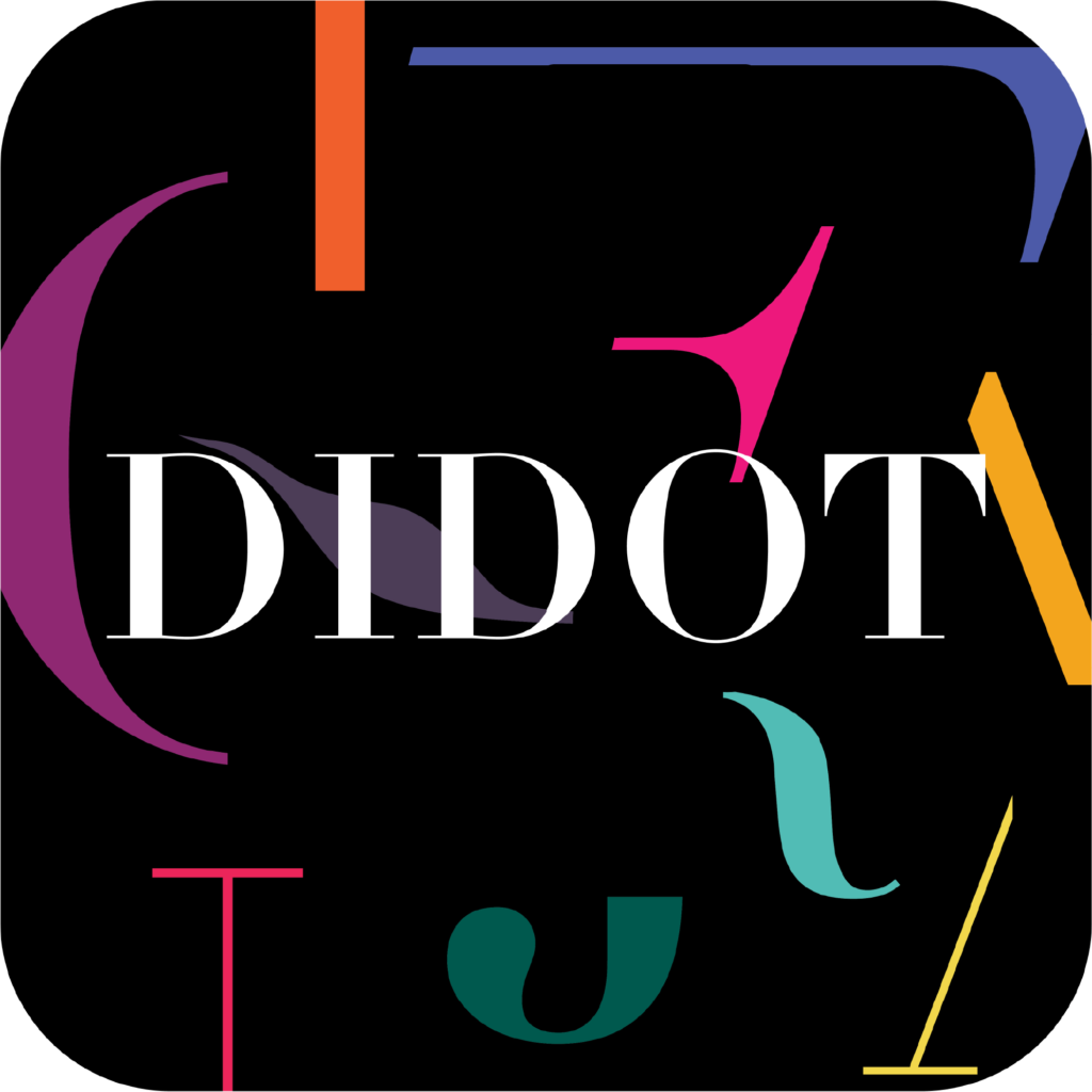
Linotype Didot is a refined serif typeface known for its elegance and high contrast between thick and thin strokes. Originally part of the Didot family from the 18th century, this modern version was designed by Adrian Frutiger in 1991. Its crisp lines and stylish appearance make it a popular choice for luxury brands, fashion magazines, and sophisticated editorial design. Linotype Didot exudes formality and timeless beauty, perfect for projects requiring both classic and modern appeal.
01 Design Challenge
02 Design Process
03 Design Solution
Develop a marketing plan for Linotype Didot with the objective of creating a piece of digital or print media that effectively promotes the typeface. The media piece should highlight the key features and unique attributes of Linotype Didot while also crafting a compelling message platform for the campaign. This project offers a valuable chance to merge commercial objectives with academic insights, aligning curriculum with real-world industry standards and expectations.
1.Historical Research and Analysis: The first step in the design process was to explore the historical use of the Linotype Didot typeface. I delved into its origins in the late 18th century and its subsequent revival in the 1990s by Adrian Frutiger. The typeface has long been associated with luxury and high fashion, famously used in prestigious magazines and by top-tier brands. However, its application has often been limited to specific contexts, primarily due to its high contrast and delicate serifs, which can make it challenging to use in smaller sizes or for body text.
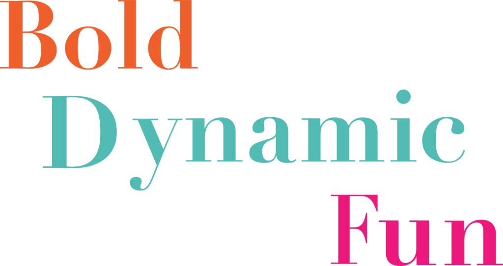
2.Identifying Limitations and Opportunities: Understanding these limitations was crucial in shaping the concept. Linotype Didot’s fine lines and sharp contrast, while beautiful, can pose readability issues in less-than-ideal printing conditions or on digital screens at smaller sizes. This analysis led to the recognition that Linotype Didot, while historically revered, had not always been fully explored in modern, digital-first contexts. This insight inspired the concept of positioning the typeface as “making a comeback”—reimagining it for a contemporary audience while acknowledging its rich history.
3.Concept Development: The concept of “A Comeback” was developed to showcase Linotype Didot as a timeless typeface that’s ready to be reintroduced and embraced in today’s diverse design landscape. The campaign aimed to demonstrate how Linotype Didot can overcome its traditional limitations, especially in digital media. By emphasising its adaptability and versatility, the concept sought to reframe the typeface as not just a classic choice for luxury design but as a modern, dynamic option suitable for a broader range of applications.
4.Visual Design and Execution: In executing this concept, I focused on designing digital and print media that highlighted Linotype Didot’s unique features while addressing past limitations. This involved experimenting with various weights and sizes to ensure readability and impact across different platforms. The design incorporated bold, modern layouts that contrasted with the typeface’s classic elegance, reinforcing the idea of a comeback. The campaign materials were crafted to appeal to a contemporary audience, blending historical reverence with modern sensibilities, thus positioning Linotype Didot as both a nod to tradition and a forward-looking design choice.
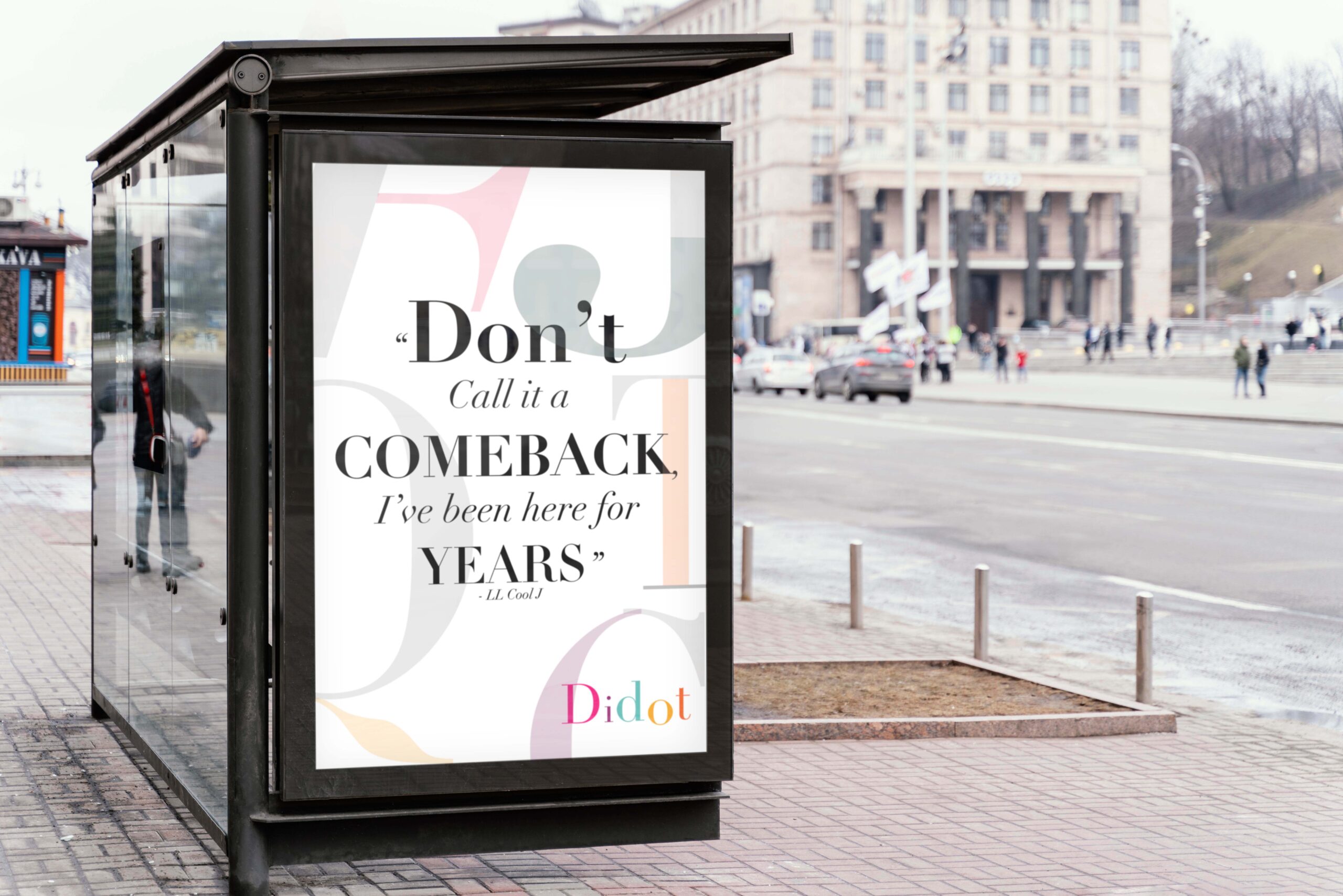
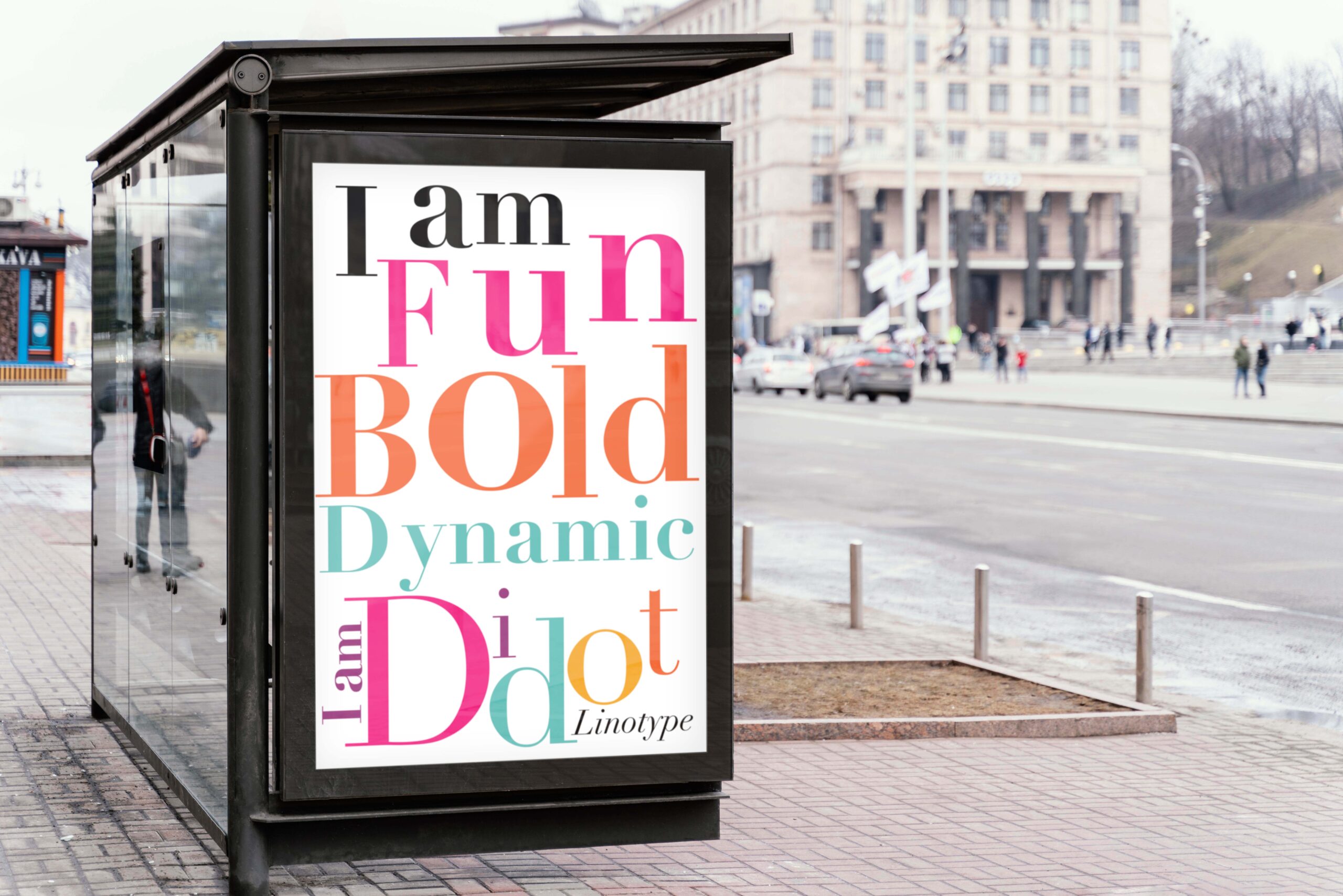
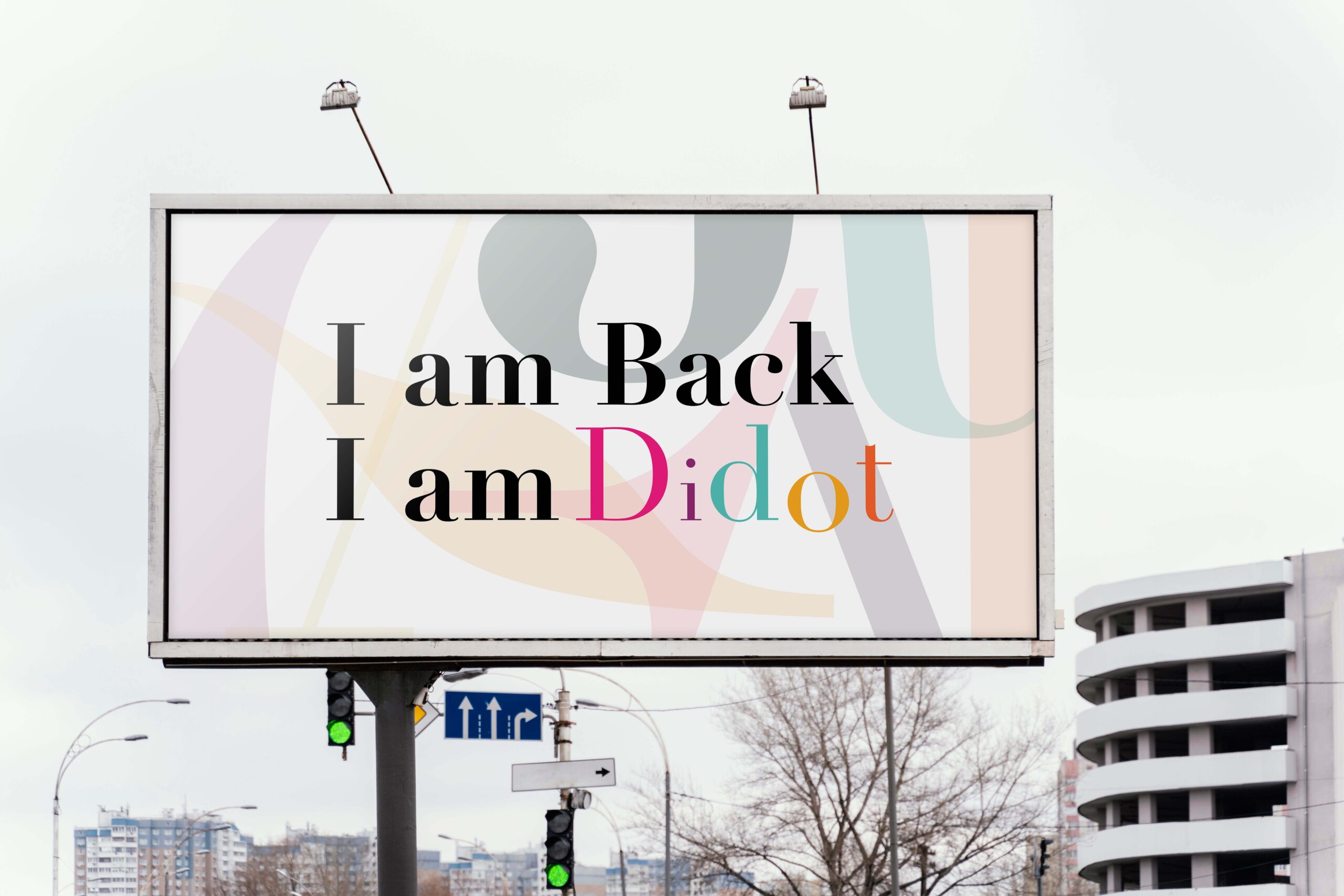
The concept “Making a Comeback” draws on the cyclical nature of fashion trends to reposition Linotype Didot for a modern audience. Recognising that this elegant typeface has long been confined to traditional fashion journalism, I aimed to break this perception by showcasing its playful, energetic, and bold potential. Central to this solution is the development of a mobile application designed to highlight Linotype Didot’s versatility in contemporary design contexts. The app not only displays the typeface’s regular use and historical applications but also demonstrates how it can be adapted to vibrant and modern designs, making it relevant to today’s designers who rely heavily on mobile technology.
To further amplify the message, I created a billboard and adshell campaign that aligns with the app’s branding, ensuring a consistent and cohesive promotion. The campaign’s positioning strategy shifts Linotype Didot from its purely elegant and traditional image to one that is also playful, eccentric, and fashionable. By doing so, it encourages designers to see the typeface in a new light, just as fashion trends evolve over time. This approach ensures that Linotype Didot is not only preserved as a classic but also embraced as a dynamic, relevant choice for contemporary design.


