
Project Type
Ilustration
Tools Used
Adobe Suites
Role
Designer
Year
2021
About
“Life Isn’t All Ha Ha Hee Hee” is a compelling novel that explores the complexities of friendship, marriage, identity, and cultural expectations within the South Asian diaspora in London through the lives of three childhood friends—Sunita, Chila, and Tania—delving into themes of love, betrayal, and the search for authenticity in a world of conflicting cultural values. The novel combines humour, drama, and poignant observations, making it a beloved work of contemporary fiction.
01 Design Challenge
02 Design Process
03 Design Solution
Design a book cover that captures the essence of the novel while appealing to a broad audience, reflecting the multifaceted lives of the three main characters and touching on themes of friendship, cultural identity, and the challenges of balancing personal desires with societal expectations. The cover should be visually striking, hinting at both the humour and emotional depth of the narrative, while resonating with readers who appreciate stories of personal and cultural exploration.
1.Research and Analysis: To prepare for designing the cover of “Life Isn’t All Ha Ha Hee Hee,” I analysed the core themes of the novel, particularly focusing on the portrayal of friendship among the three main characters—Chila, Sunita, and Tania. The narrative emphasizes their deep, enduring bond, which begins in childhood and withstands the challenges of adult life. I explored the significance of these themes, understanding that their friendship serves as the emotional backbone of the story. Additionally, I examined the cultural context, recognizing the importance of Indian traditions and symbolism, particularly the use of gold in representing something precious and valuable, which informed my design choices.
2.Concept Development: The central concept for the cover design revolves around the symbolism of a gold bracelet, a cultural artifact rich with meaning in Indian traditions. This bracelet represents the unbreakable bond of friendship between the three characters. Each charm on the bracelet is uniquely designed to symbolize one of the characters, using colour and design to reflect their individual personalities while still showing their connection to each other. The bracelet as a whole signifies the strength, value, and precious nature of their relationship, which endures despite life’s challenges.
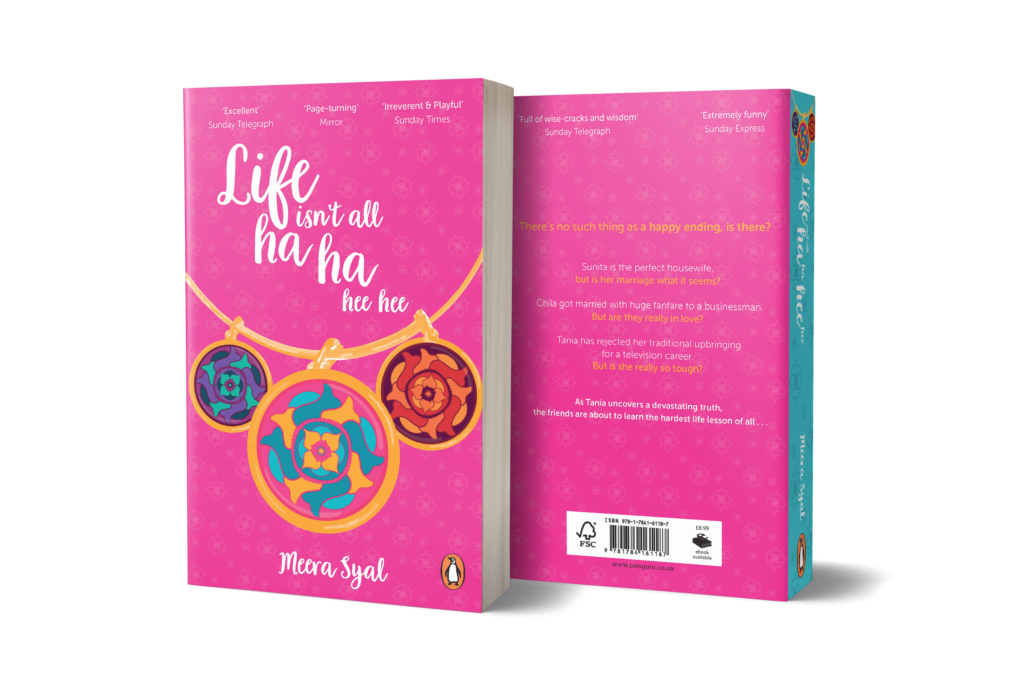
3.Visual Design: The visual design of the cover features a vibrant pink background, chosen to evoke a sense of warmth, vibrancy, and playfulness, aligning with the novel’s blend of humour and emotional depth. The gold bracelet and its charms are the focal point of the design, with intricate details that draw the viewer’s attention. The typography for the title is playful yet elegant, reflecting the light-hearted elements of the story while maintaining a sophisticated feel that complements the novel’s deeper themes. The layout is designed to be visually striking, making the cover stand out while also inviting readers to explore the rich, layered narrative within.
4.Cultural & Symbolic Significance: Understanding the cultural significance of gold in Indian traditions was crucial to the design process. In Indian culture, gold is often associated with wealth, purity, and great value. By incorporating a gold bracelet into the design, I aimed to convey the idea that the friendship among the three characters is not only central to the story but also invaluable and unbreakable. The charms on the bracelet, each representing one of the characters, further shows their unique qualities and the individuality they bring to their collective bond.
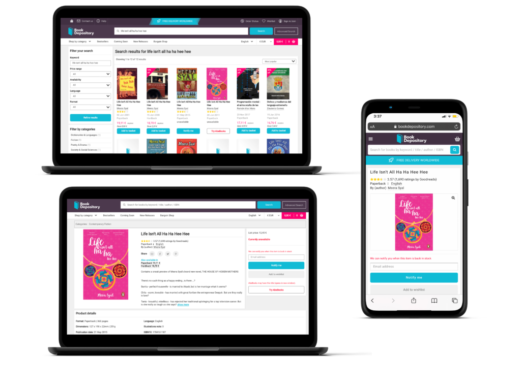
In response to the brief, the cover design for Life Isn’t All Ha Ha Hee Hee captures the essence of the novel by reflecting the multifaceted lives of the three main characters—Chila, Sunita, and Tania—while appealing to a broad audience. The design centres on a gold bracelet, symbolising the unbreakable bond of friendship that ties these women together, despite the challenges they face in balancing personal desires with societal expectations. Each charm on the bracelet uniquely represents one of the characters, using colour and design to convey their individual personalities and cultural identities.
The vibrant pink background and playful typography bring forth the novel’s blend of humour and emotional depth, making the cover visually striking and engaging. This design solution effectively hints at the narrative’s complexity, resonating with readers who appreciate stories of personal and cultural exploration, while also ensuring broad appeal through its striking visual elements and thoughtful symbolism.
Other Related Projects