

Project Type
Branding, Campaign & merchandise
Tools Used
Adobe Suites
Role
Designer
Year
2022
About
Liveable Limerick is a social movement driven by volunteers dedicated to enhancing the city’s livability through community projects and advocacy. The group’s vision is to transform Limerick and the Mid-West into a model of sustainable and enjoyable urban and rural living. This campaign aims to design a brand strategy and communication plan that effectively conveys Liveable Limerick’s core values and engages the community in their mission.
01 Design Challenge
02 Design Process
03 Design Solution
Develop a strategic awareness campaign for Liveable Limerick. This campaign should be precisely targeted, creatively executed, and dynamically engaging, ensuring clear and effective communication of the group’s core messages. The final solution must showcase an innovative approach to connecting with the defined target audience, enhancing community engagement and support for Liveable Limerick’s objectives and initiatives.
1.Research and Analysis: The design process for Liveable Limerick’s awareness campaign, I started by diving deep into the group’s core values, recent activities, and target audience. My focus was on understanding the key themes of sustainability, community engagement, and urban improvement that drive Liveable Limerick’s mission. I reviewed past campaigns and assessed current strategies to pinpoint strengths and areas for enhancement. Additionally, I studied the demographics, interests, and communication preferences of the target audience to ensure that the campaign would resonate effectively.
2.Concept development: With a solid understanding of the group’s mission and audience, I moved on to developing a creative concept for the campaign. My goal was to capture Liveable Limerick’s core messages in a way that was both visually and emotionally engaging. I explored various themes and visual styles that aligned with the group’s vision of a greener, more inclusive, and vibrant Limerick. The concept focused on innovative ways to showcase the group’s achievements and future goals, incorporating storytelling, impactful visuals, and interactive elements to connect with the audience.
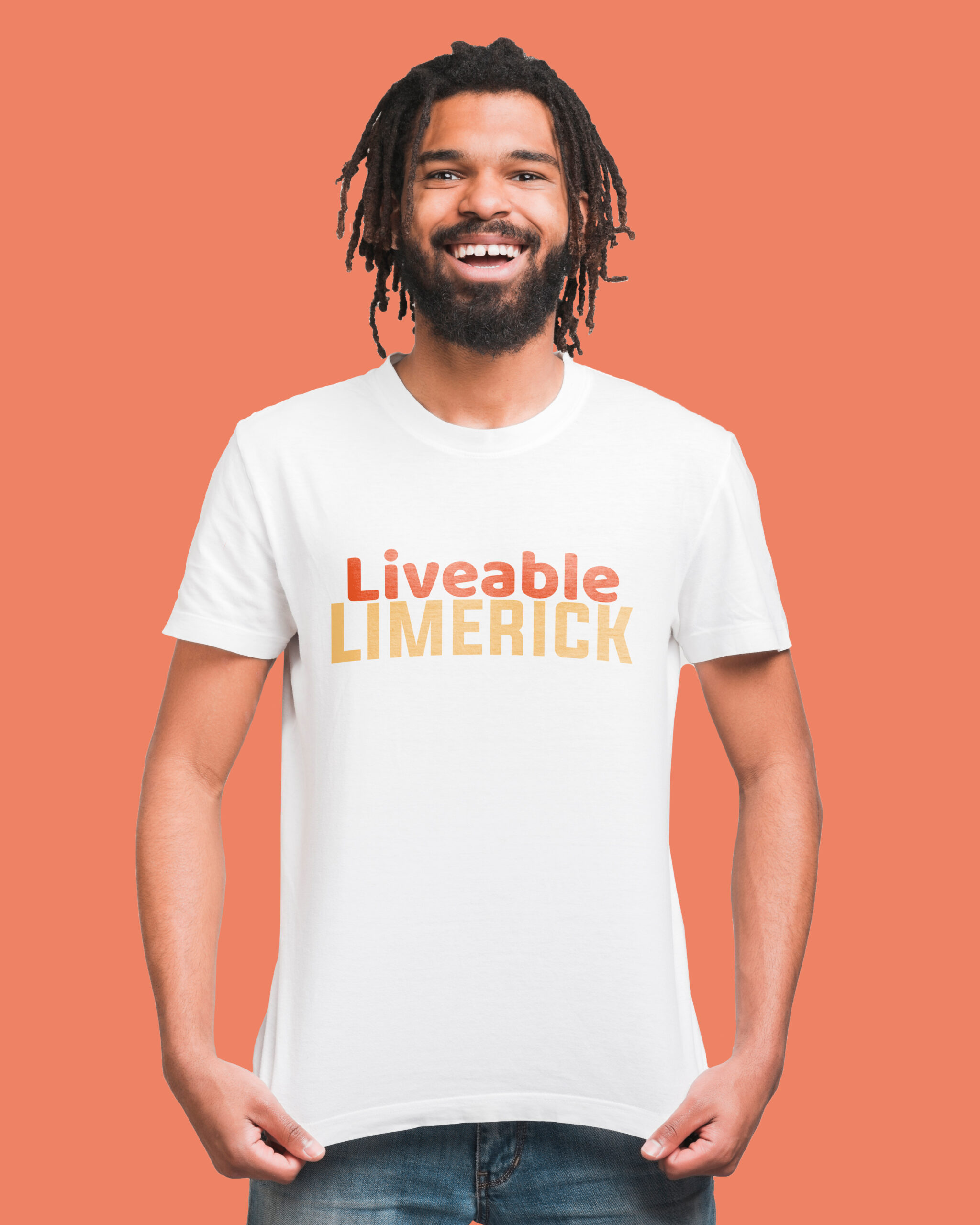
3.Visual Design: Once the concept was finalised, I began translating it into tangible design materials. I created a cohesive visual identity for the campaign, including a logo, colour palette, typography, and imagery that reflected Liveable Limerick’s energy and ambitions. I designed a range of materials, from social media graphics and posters to flyers and digital ads, ensuring each piece effectively communicated key messages and engaged the target audience. The design was vibrant and modern, perfectly aligned with the group’s values of ambition, inclusivity, and community focus.
4.Implementation and Evaluation: With the design complete, I then focused on implementing the campaign across various channels, including social media, local media, and community events. I coordinated with Liveable Limerick to ensure a smooth launch and effective reach to the intended audience. Throughout the campaign, I monitored engagement metrics and gathered feedback to evaluate its impact. Based on this data, I made necessary adjustments to optimise the campaign’s effectiveness, ensuring that the core messages were communicated clearly and compellingly.
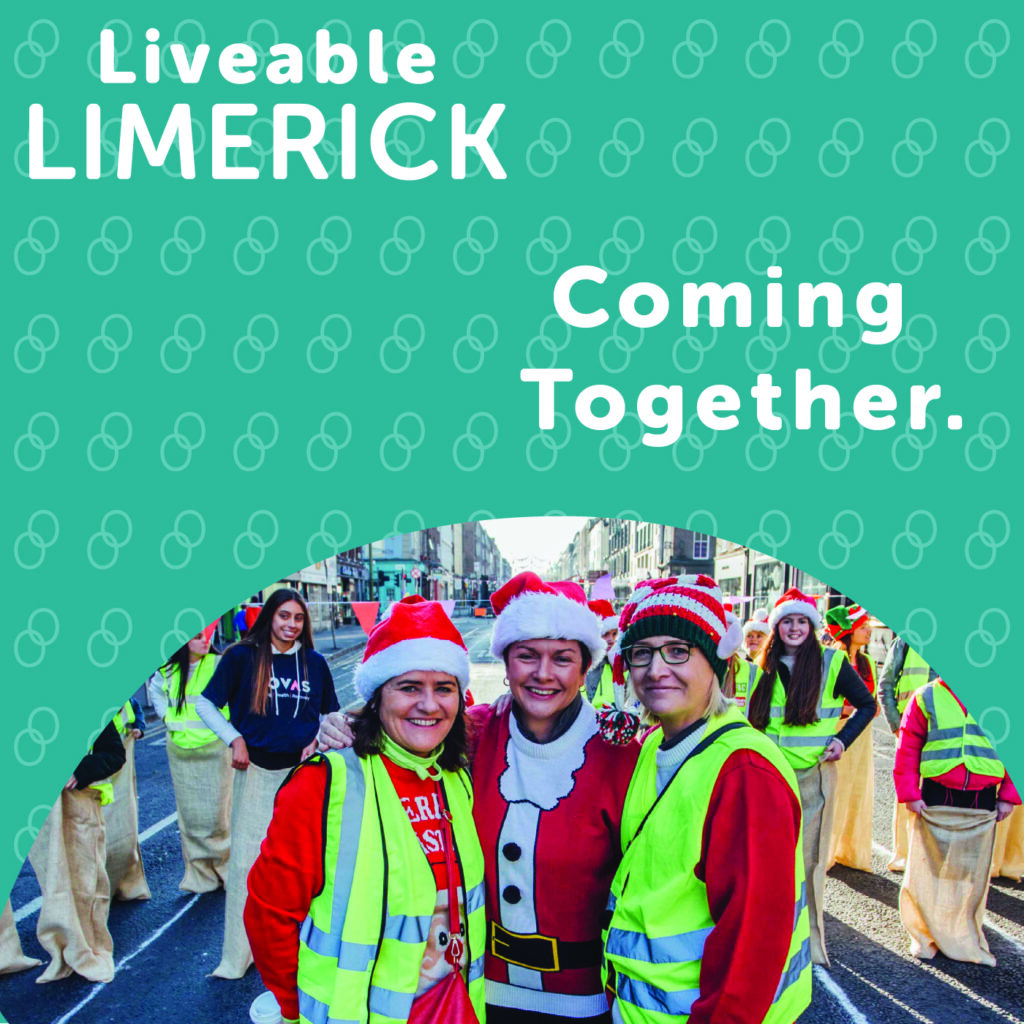
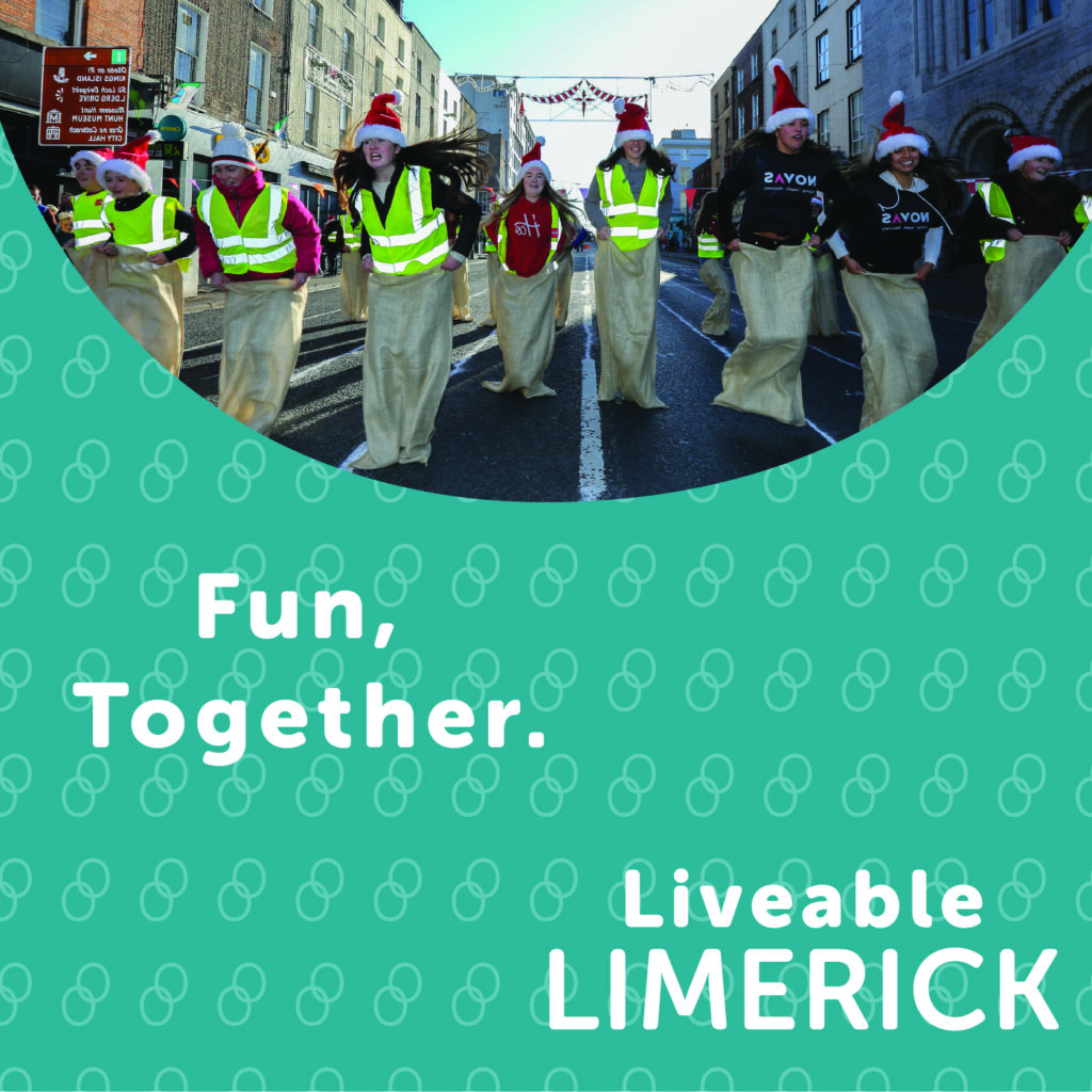
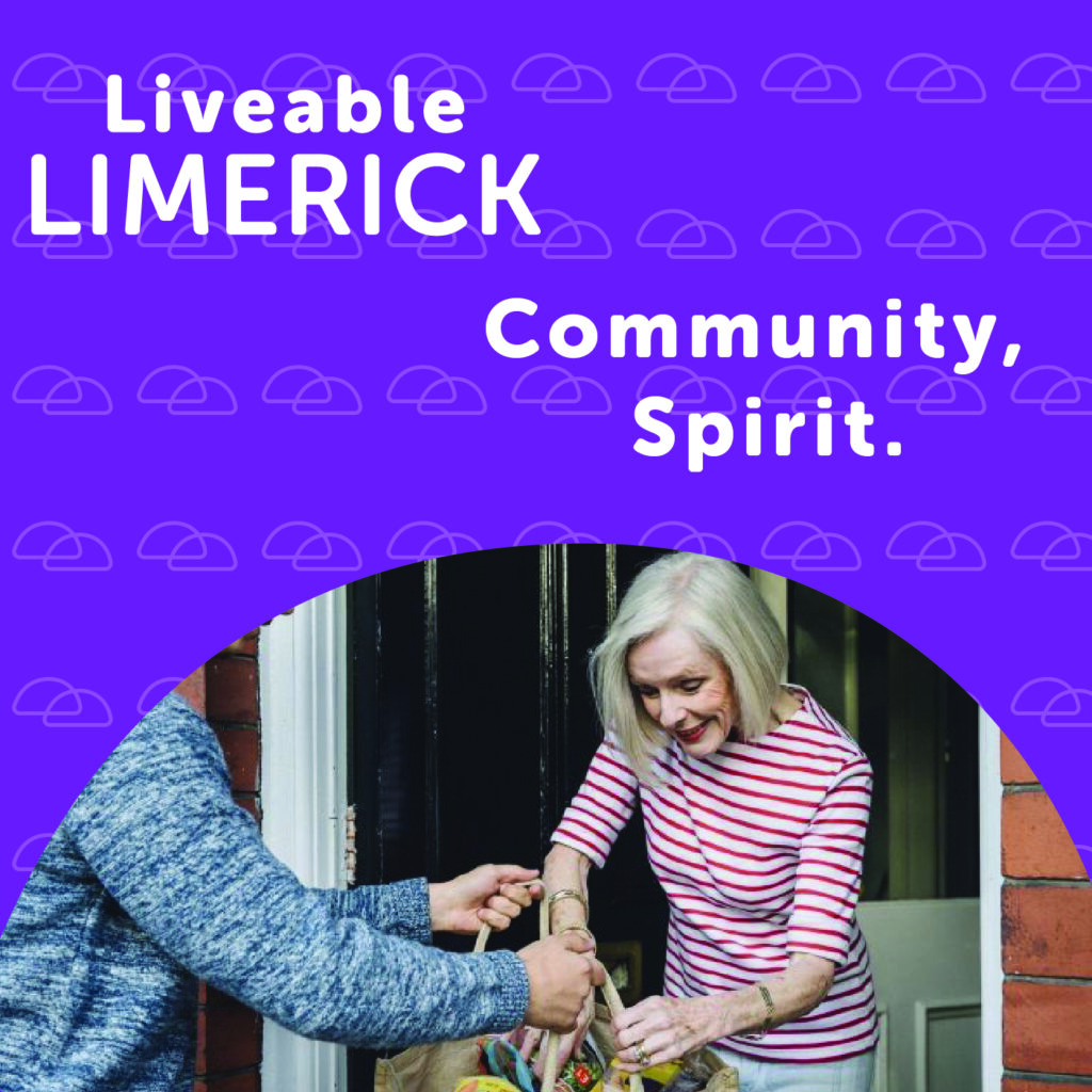
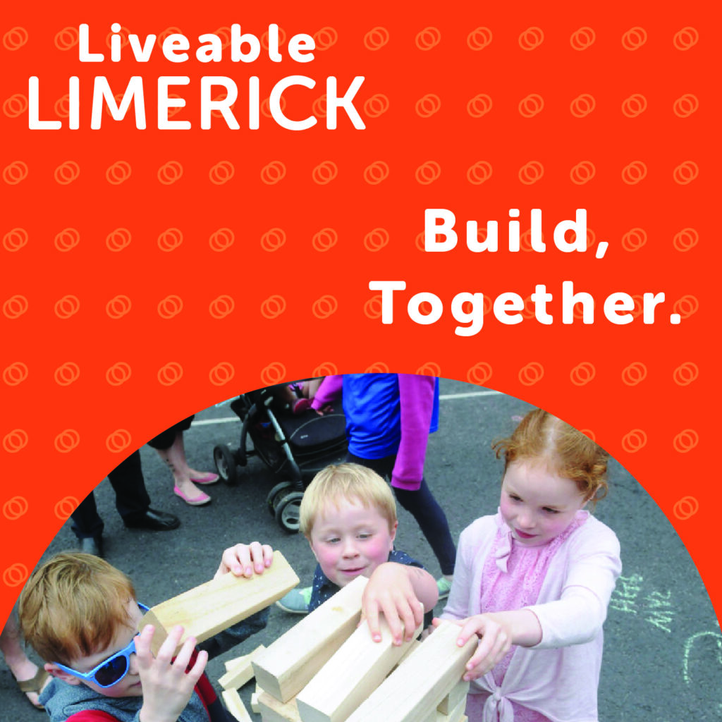
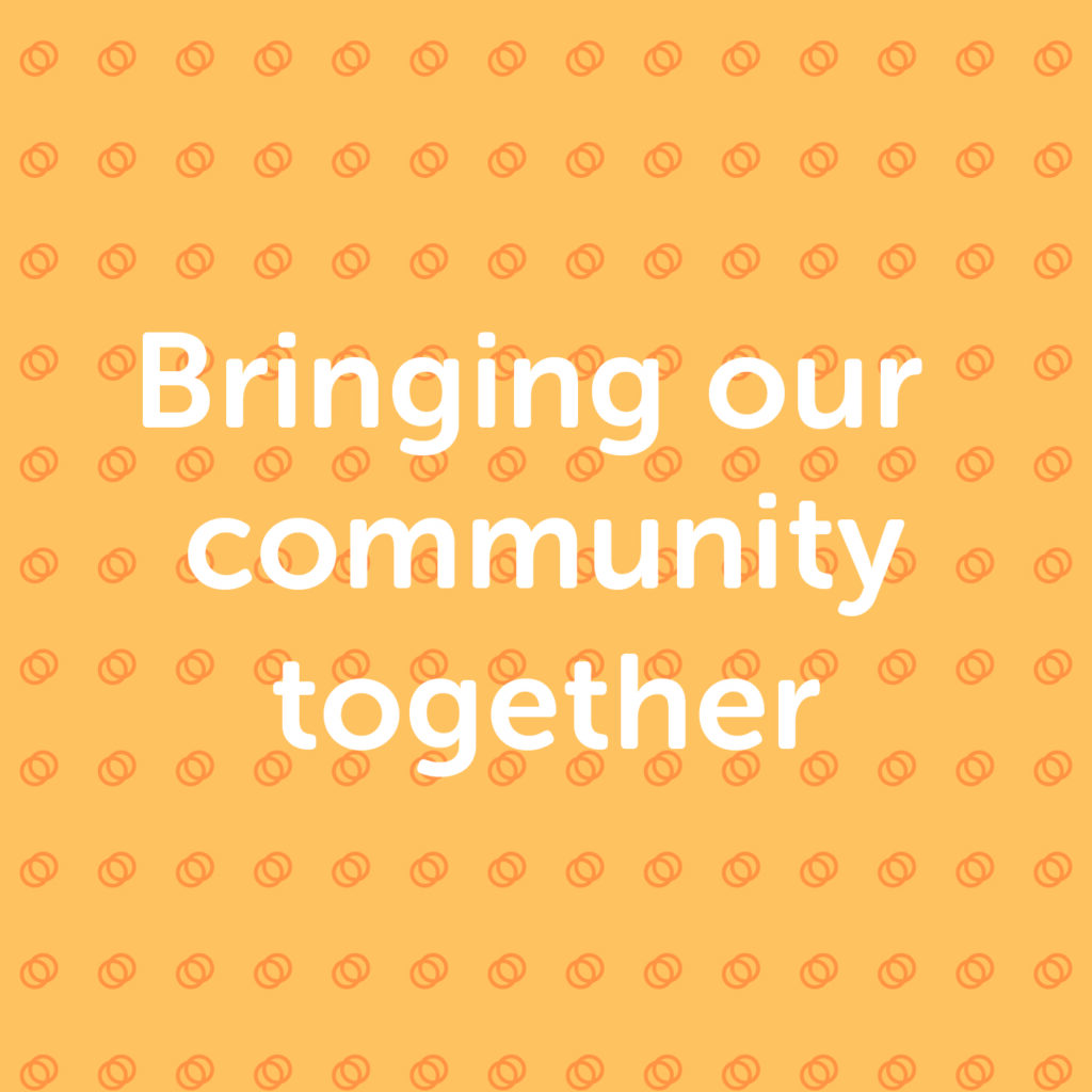
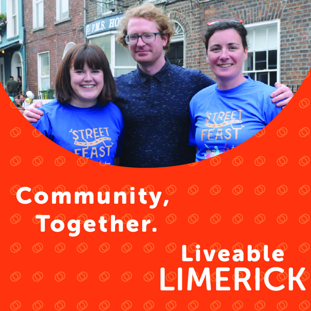
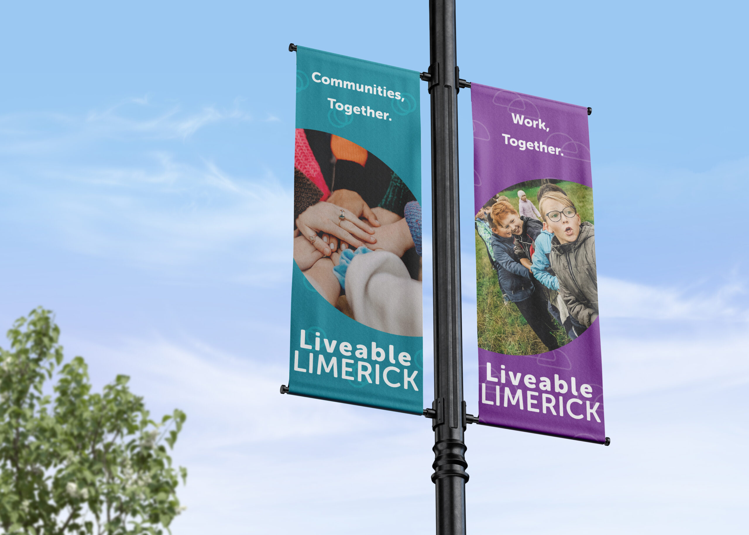
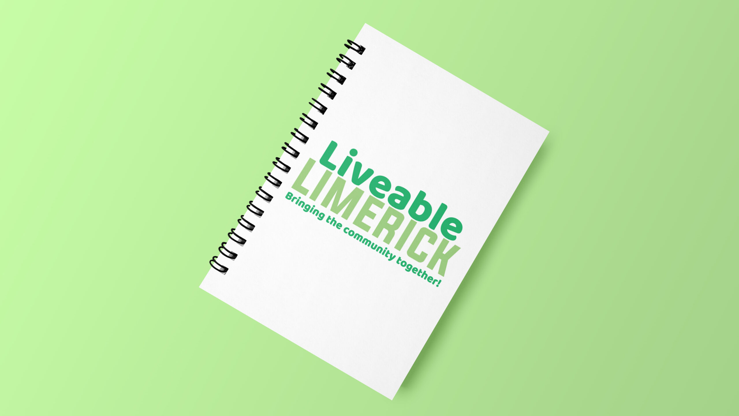
The design solution for the Liveable Limerick awareness campaign features a refreshed brand identity centred around a new wordmark logo and the tagline “Bringing Communities Together.” This logo has been thoughtfully crafted to encapsulate the group’s core values and mission, using a dynamic and engaging visual approach.
The new wordmark logo is designed with creativity, fun, and ambition as key elements. Each of these keywords is represented through distinct visual motifs derived from the wordmark itself. The concept involves using negative shapes taken from the logo to create a unique brand pattern that reinforces the group’s identity and message:
Creative: Represented by a semi-curved circle in purple, derived from the middle of the letter ‘e’ in the wordmark. This choice of colour and shape symbolises imagination and innovation, aligning with Liveable Limerick’s commitment to fostering creative solutions and ideas.
Fun: Captured through a blue circle taken from the letter ‘i’. This vibrant and playful element conveys a sense of enjoyment and approachability, reflecting the group’s efforts to make community engagement enjoyable and lively.
Ambitious: Expressed with an orange oval taken from the centre of the letter ‘b’. This bold and striking shape represents the group’s forward-thinking and aspirational goals for Limerick’s development.
These negative shapes are integrated into the design to form a cohesive and versatile brand pattern that visually connects the different facets of Liveable Limerick’s mission. The use of blue, orange, and purple colours not only creates a vibrant and engaging visual identity but also highlights the group’s core values in a memorable and distinctive manner.
Overall, this design solution aims to bring a fresh, creative, and ambitious look to Liveable Limerick, enhancing its visibility and appeal while effectively communicating its core message of community unity and positive change.
